Selected workInformation Design & Visual Communication
A selected collection of projects where the main challenge was not only creating visuals, but helping people understand information clearly — whether through event layouts, maps, signage, infographics, reports or campaign graphics.
These examples focus on spatial communication, visual hierarchy, map-led storytelling and public-facing information design across print, digital and event environments.
01 | Spatial & Event Communication
02 | Map-led Visual Story-telling
03 | Infographics & Information Hierarchy
01 | Spatial & Event Communication
Visual systems and layouts created to support real event environments, helping guests, exhibitors, production teams and stakeholders understand spaces, routes and branded touchpoints more clearly.
Great Place to Work Ceremony
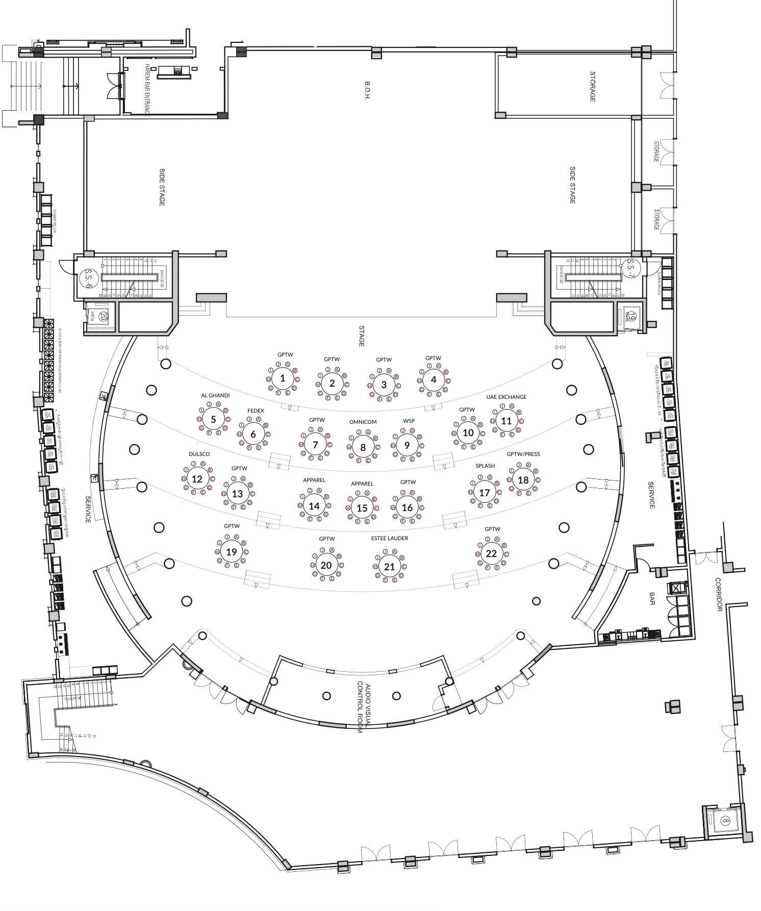
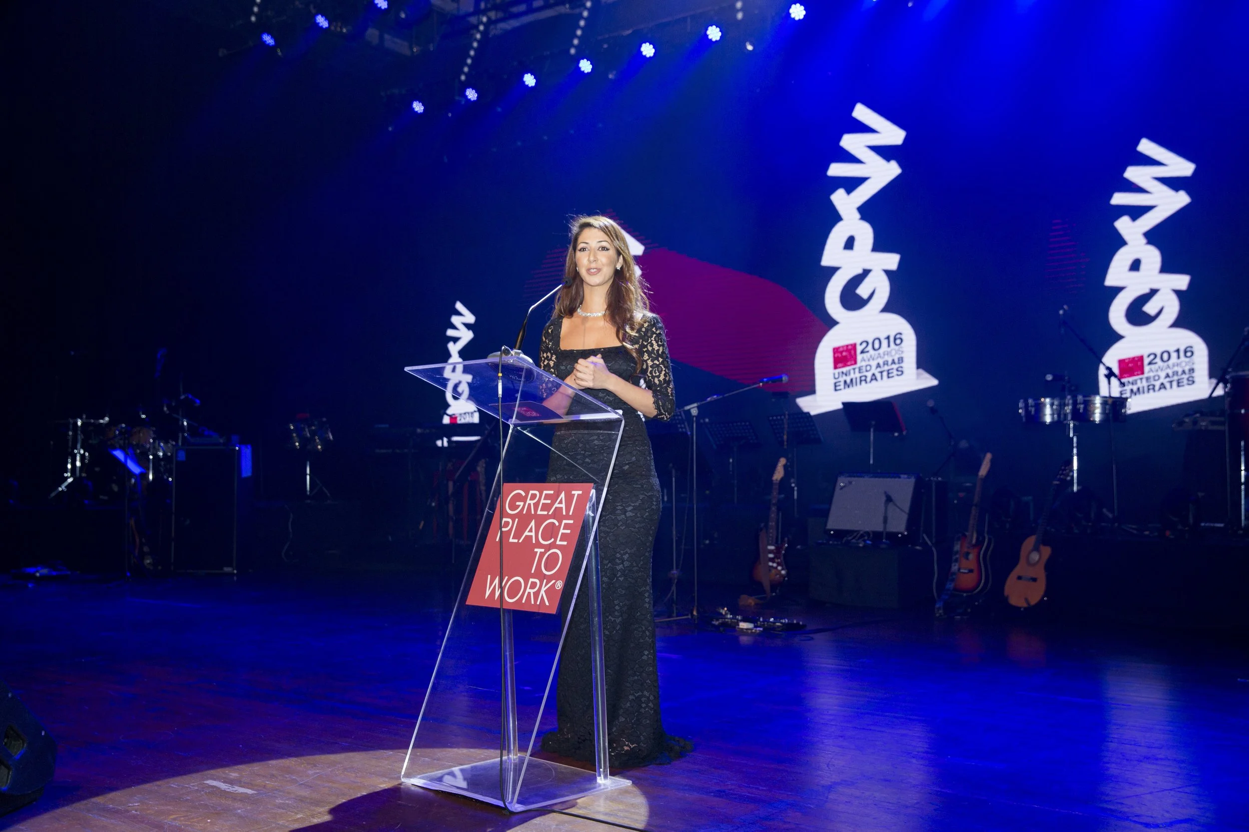
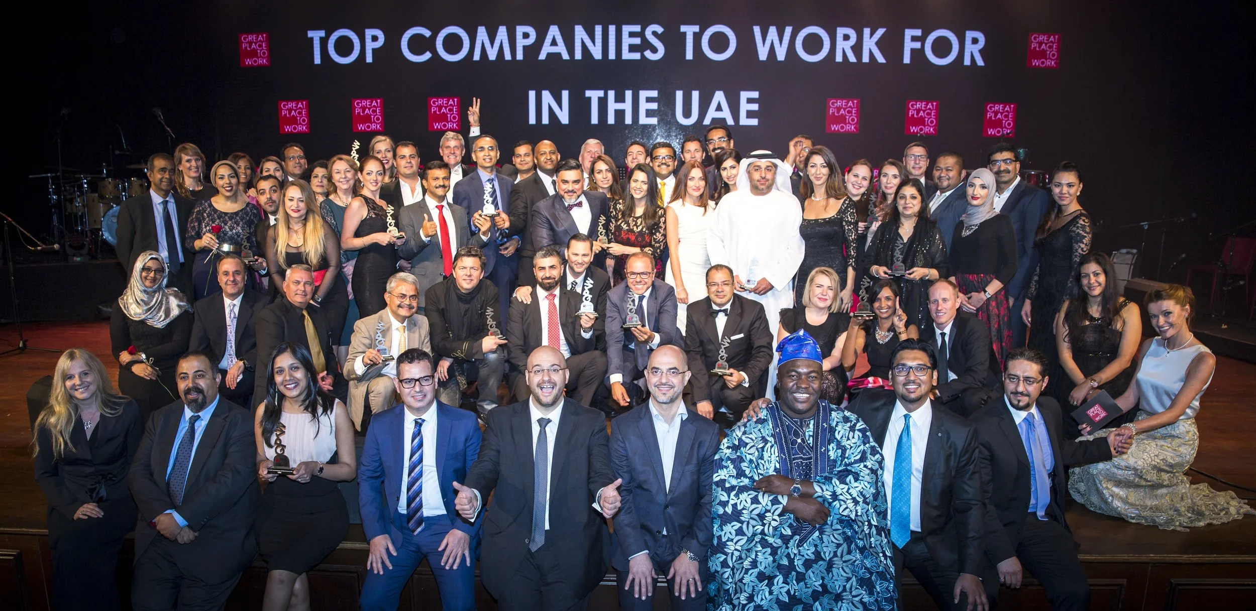
For the Great Place to Work ceremony, I worked across a wide range of event materials including the floor map, signage, stage backdrops, digital screens, invitations, menus, table decorations, entrance stand and award design.
The project required a consistent visual approach across many different touchpoints, from guest-facing materials to production-related layouts. The focus was on creating polished event communication that supported both the ceremony experience and the practical needs of the venue.
Almas Bazar Exhibition
Exhibition layout / floor plan / signage / booth graphics
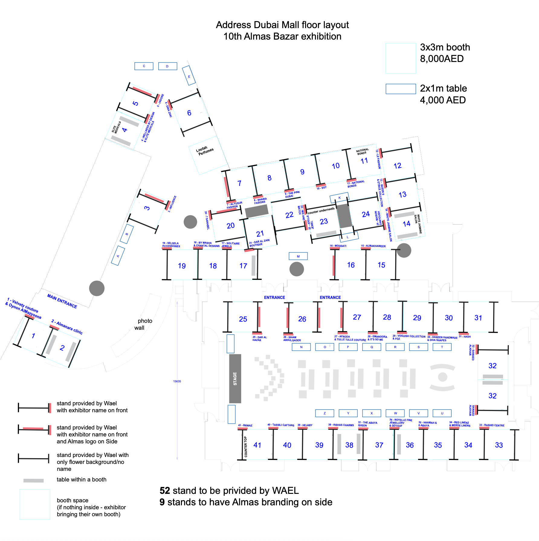
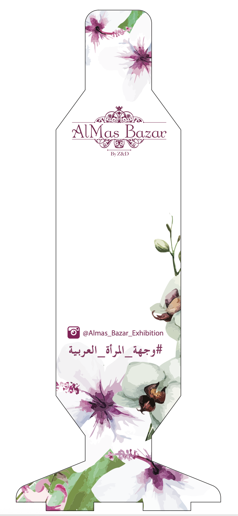
For the Almas Bazar exhibition, I worked on the event floor map, signage, invitations, booth stand graphics and welcome digital screen. The floor plan involved many last-minute changes, so the work required careful organisation, clear labelling and quick updates while keeping the information usable for exhibitors and production teams.
The map had to communicate booth locations, entrances, stand types and production notes in a structured way, supporting both event planning and on-site coordination.
Route & Location Maps
Simplified maps / wayfinding support / location-based communication
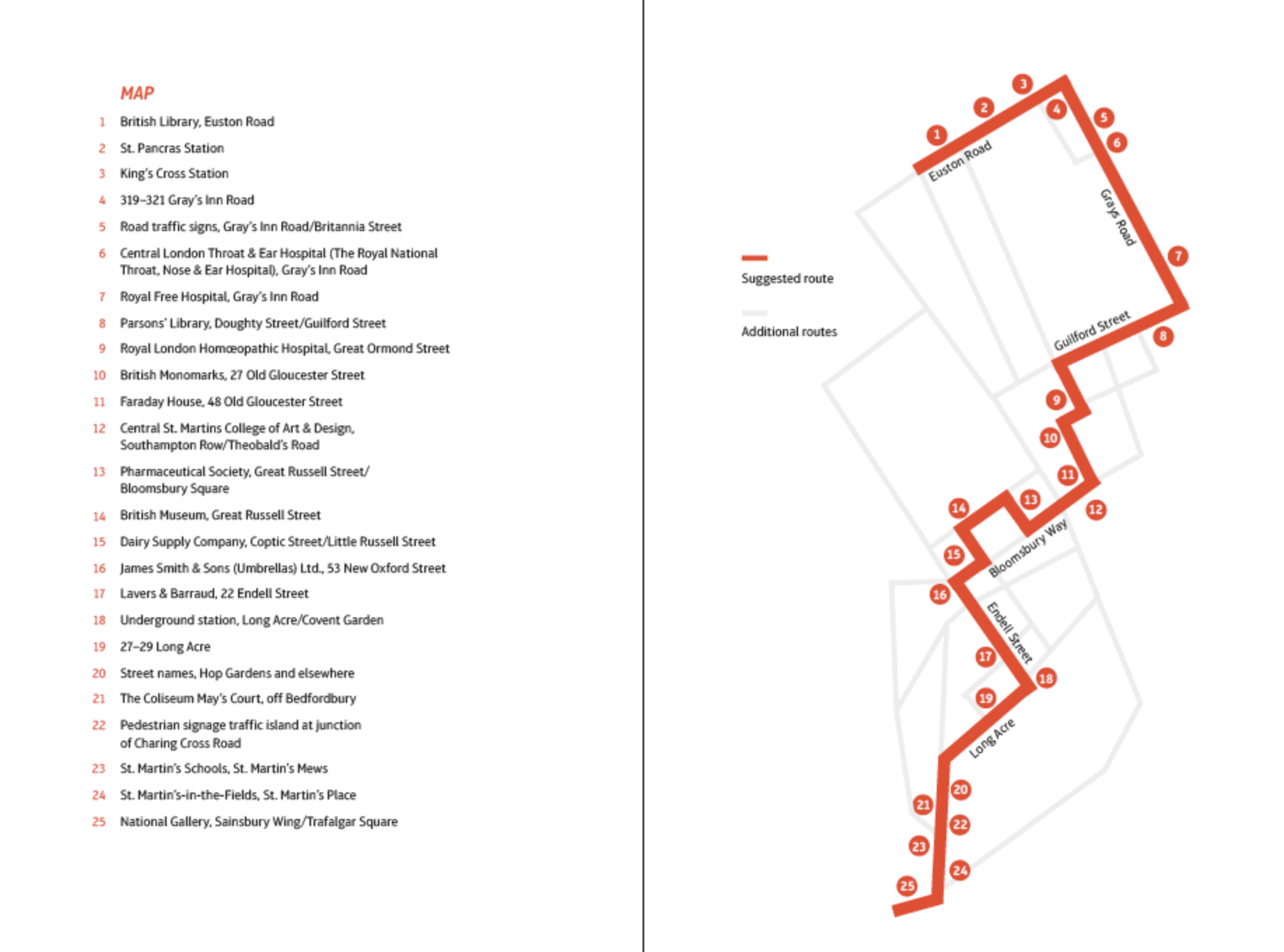
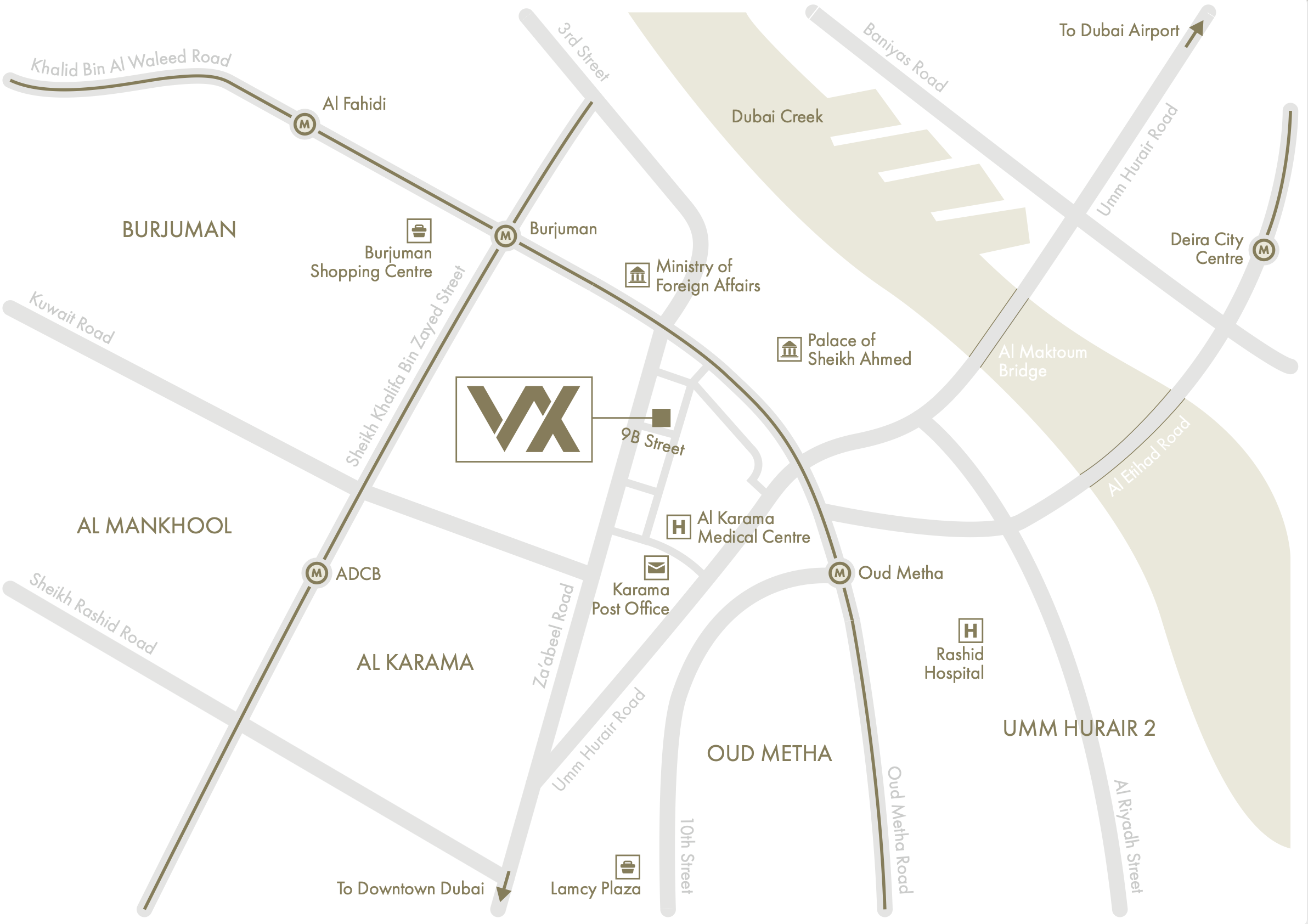
These one-off map projects were created to make locations easier to understand at a glance. One map simplified a multi-stop route using numbered points and a suggested path, while another showed the location of an office in relation to nearby roads, landmarks and transport connections.
The focus was on reducing location information into clear, practical visuals that could help users orient themselves quickly.
02 | Map-Led Visual Storytelling
Map-based visuals created for different campaigns and formats, combining geographic information with imagery, icons, labels and short content blocks.
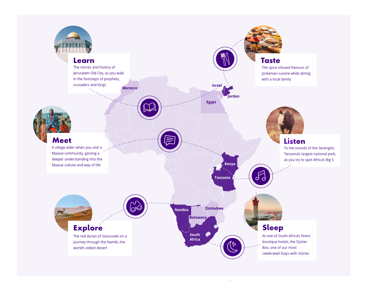
Destination Map Series
Campaign maps / icons / visual storytelling
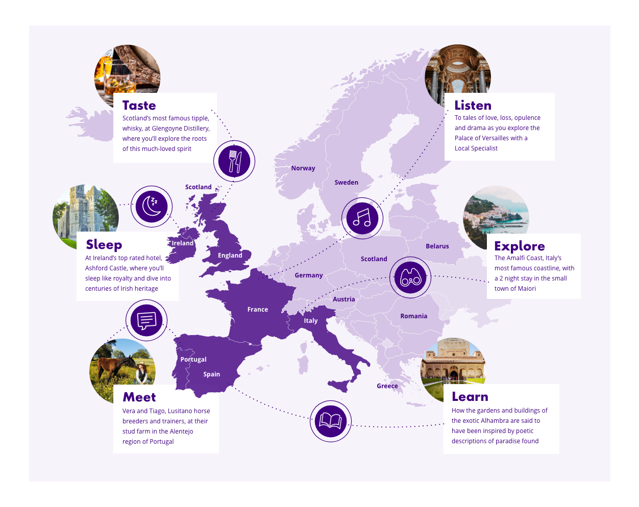
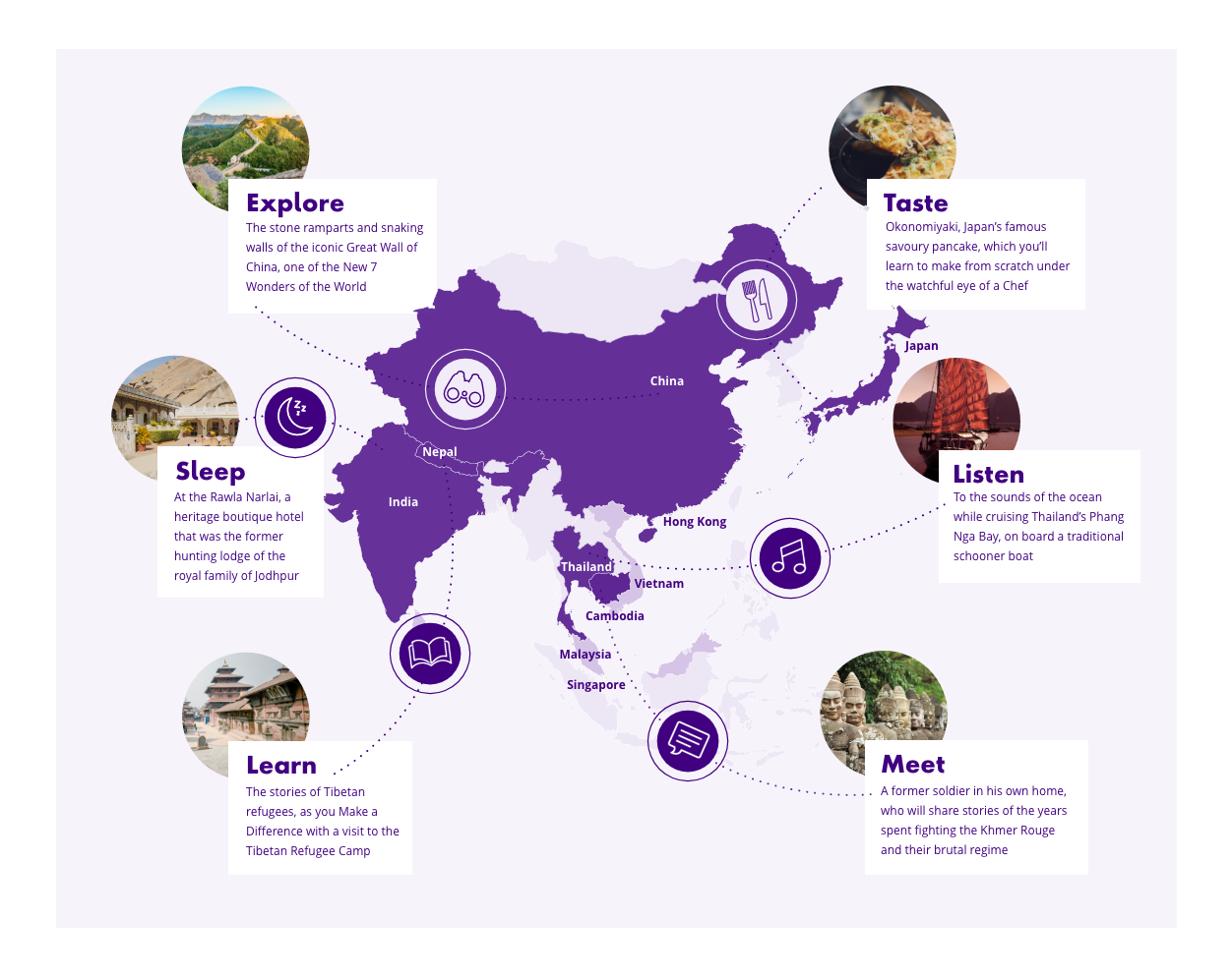
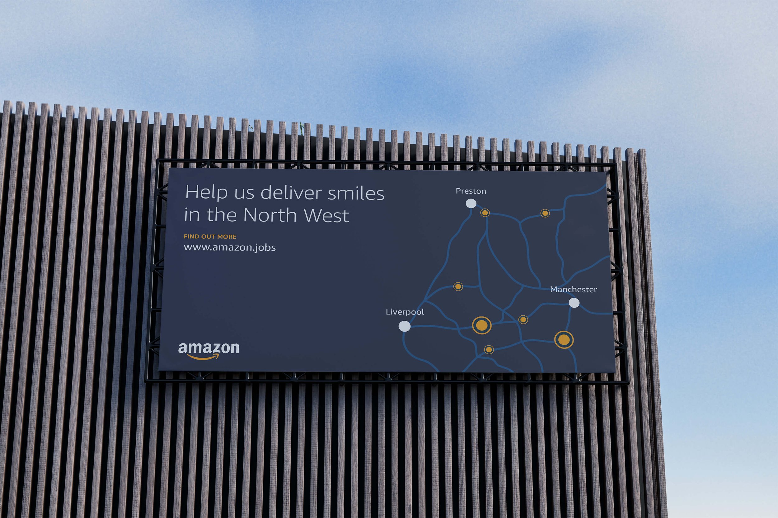
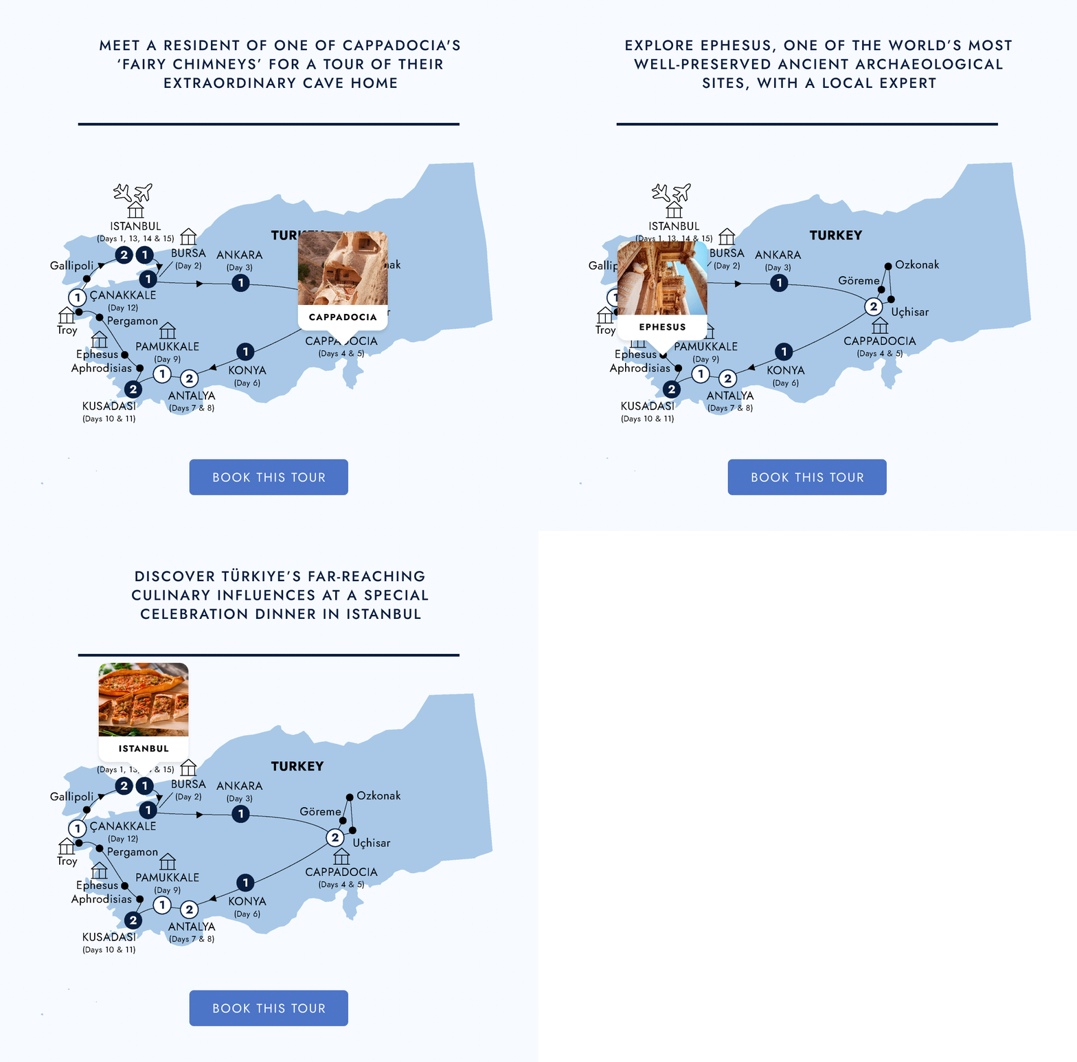
Across several travel campaigns, I created map-led visuals that used geography as the main structure for storytelling. These designs combined regional maps with images, icons, dotted paths, labels and short content cards to highlight destinations, cultural experiences and key travel moments.
Some of these visuals were created for digital channels such as web and social, while others were adapted for printed or out-of-home campaign formats. The aim was to make destination information feel engaging, structured and easy to scan.
03 | Infographics & Information Hierarchy
A selection of infographic and report-based work created to turn complex information into clear, scannable visual communication.
Campaign Infographics
Information design / icons / data-led storytelling
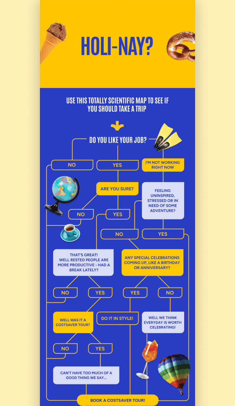
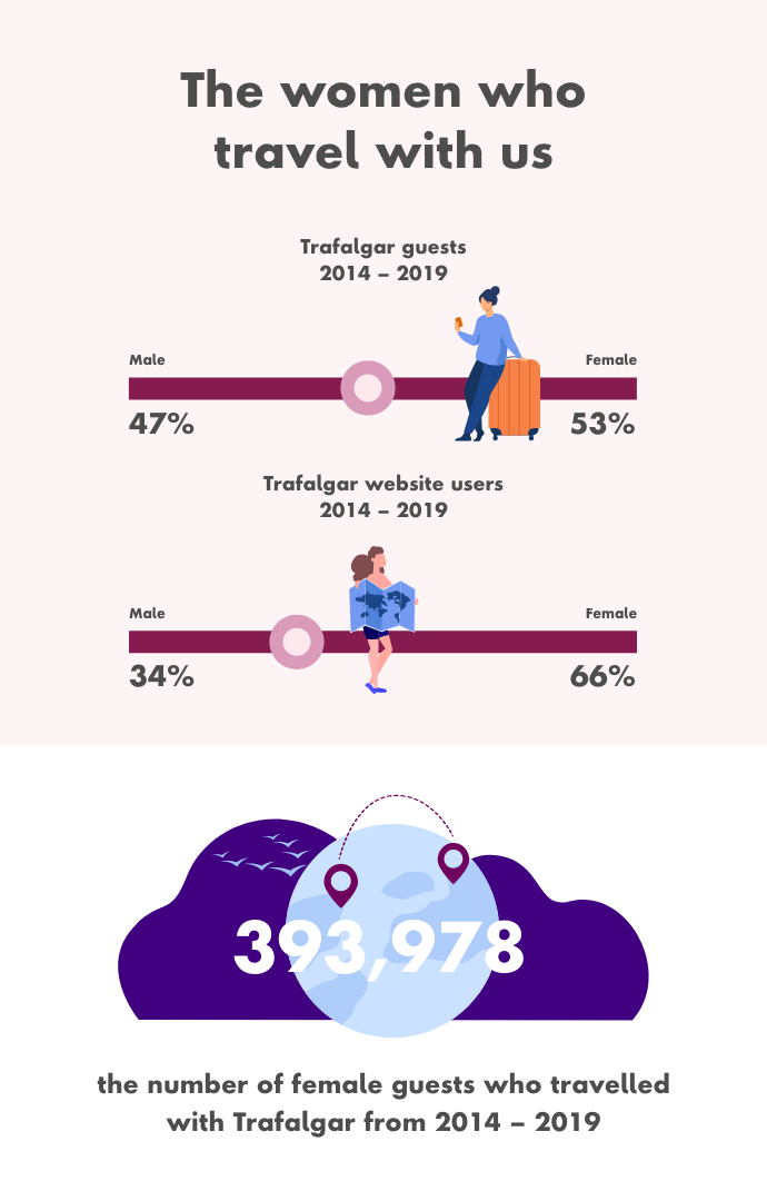
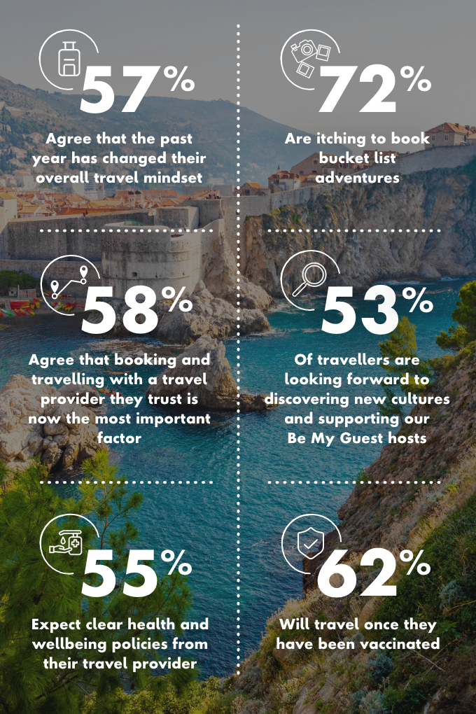
I created a variety of infographics for different brands and campaigns, ranging from image-led editorial graphics to more structured visual systems built around icons, statistics, quotes and content sections.
The focus was on making information easy to follow, especially when working with longer content or multiple messages within a single visual piece. This often involved creating a clear reading order, grouping related information and using visual hierarchy to guide the viewer through the content.